Our Workforce Faces a Dual Risk: Aging Talent and the Rise of AI & Automation
As our region’s workforce continues to age, we face a critical challenge: many of the occupations essential to our economy are approaching a retirement cliff, yet they remain difficult to automate. These roles rely heavily on human skills, expertise, and judgment — capabilities that AI and robotics cannot easily replicate.
This means that as experienced workers retire, we risk significant talent shortages with no quick technological fix. To address this, we must proactively identify where the greatest vulnerabilities exist and take steps to attract, train, and retain the next generation of talent.
This dashboard brings those risks into focus — highlighting the occupations most exposed to both retirement and automation challenges — so we can build a more resilient, future-ready workforce.
How it Works
This dashboard uses data and methodology from Lightcast to assess two critical risks across occupations in our region:
Retirement Risk: The percentage of workers aged 55 and older in each occupation — highlighting where retirements may soon create talent gaps.
Resilience to Automation: A measure of how difficult it is to automate or replace a role with AI or robotics. Higher scores mean more human-centered tasks that technology struggles to replicate.
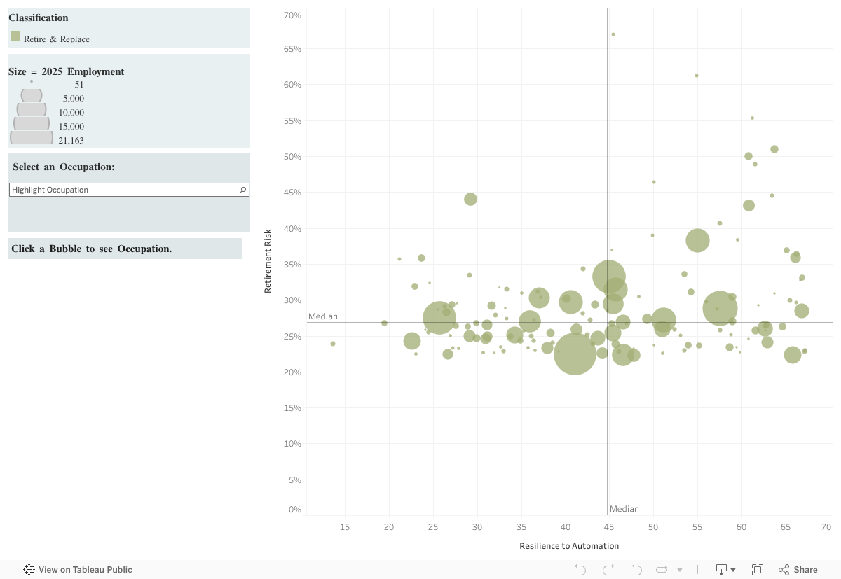
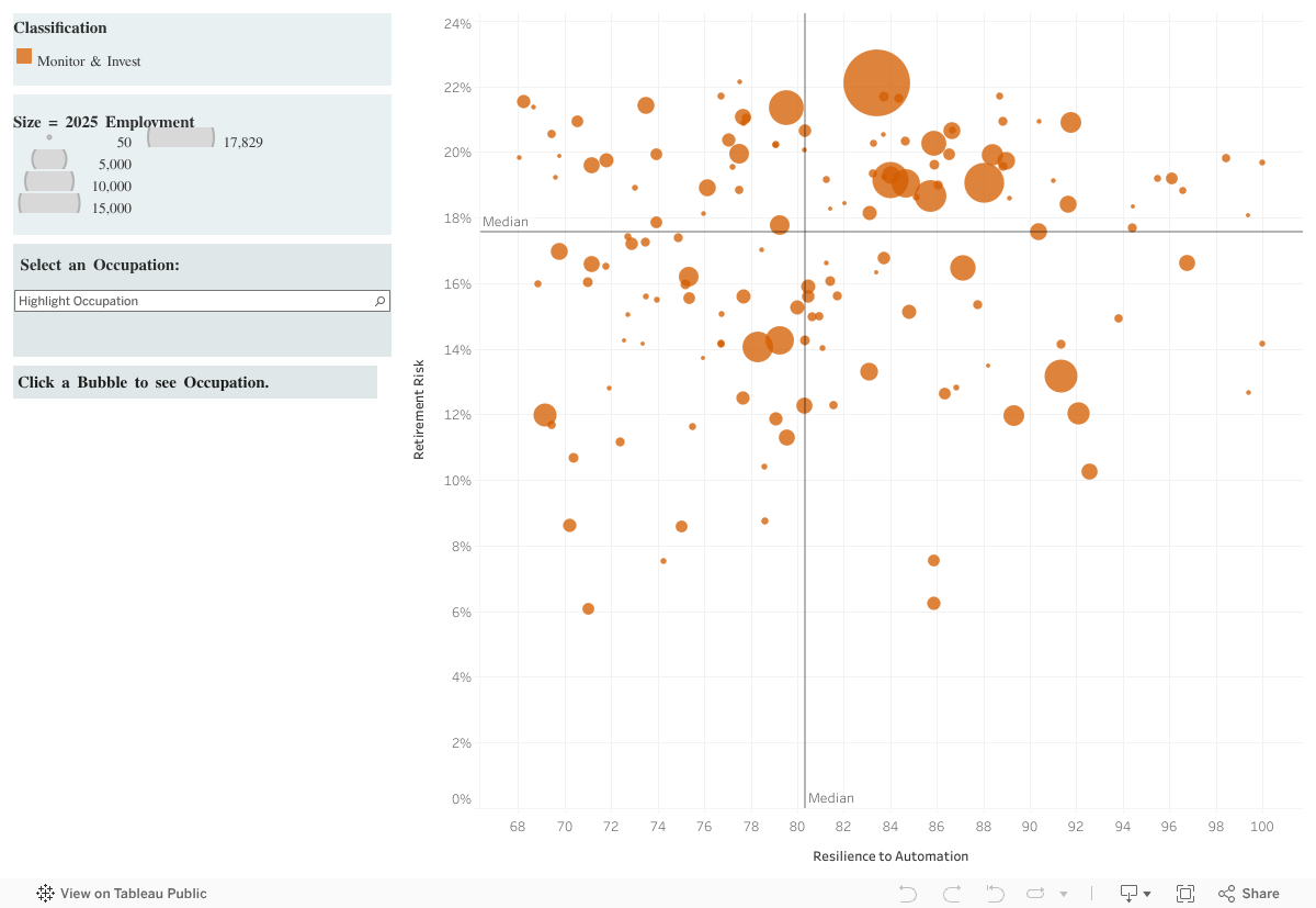
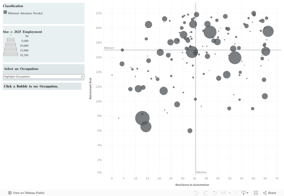
Together, these metrics identify occupations that are both hard to automate and at high risk of losing experienced workers — the ones most critical to protect.
Each bubble on the chart represents an occupation:
Bubble size = projected number of workers in 2025
Bubble color = urgency level (see legend below)
Instructions
This interactive dashboard allows you to explore how retirement risk and automation resilience vary across occupations. You can interact with it in two main ways:
1. Explore by Clicking on the Chart
Each bubble on the chart represents a specific occupation.
Click a bubble to view detailed information about that occupation in the left-hand panel.
Details will include the occupation name, projected employment in 2025, retirement risk score, automation resilience score, and the assigned priority level.
You can click multiple bubbles to compare occupations or focus on one to dive deeper into its risk profile.
2. Search by Occupation Name
- Use the dropdown menu or search bar on the left panel to find a specific occupation by name.
- Once selected, the dashboard will highlight the corresponding bubble on the chart.
- Click the highlighted bubble to view that occupation’s details in the panel.
Interpreting Results
This dashboard is a tool for identifying workforce vulnerabilities — and opportunities — based on retirement risk and automation resilience. Once you’ve explored the data, here’s how to make sense of what you see:
- Horizontal Axis – Resilience to Automation
- Right = More Resistant (harder to automate)
- Left = More Automatable
- Vertical Axis – Retirement Risk
- Top = Higher Risk (more older workers)
- Bottom = Lower Risk
- Bubble Size = Projected 2025 employment—larger bubbles = more workers in that role.
- Bubble Color – Priority Level
- Red: Top Priority – Protect & Plan
- Yellow: Retire & Replace
- Green: Monitor & Invest
- Gray: Minimal Attention Needed